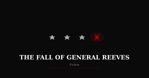
Where’s the X? This Isn’t Confusion
It’s Manipulation Disguised as Design
There was a time when clicking the X actually meant goodbye. It was clean, final, functional—an act of control.
Now the X is often hidden—faint gray on white, barely there, or shrunken to the size of a dot. Sometimes it’s invisible until your mouse floats just right. Sometimes it’s tucked away in a corner you’ve never had to check. And sometimes it’s present—but dishonest. You click, thinking you’re closing a window, and instead you’re greeted by an ad, a video, or a fresh tab asking if you’re sure you want to leave.
Five Xs or more might appear on a screen. Six. Sometimes even more. They crowd corners, float over content, blend into banners. One might close the box. Another might do nothing. One launches an offer. One triggers a download. Another simply reloads the same junk you were trying to escape. Some are real, some are fake, some are just confusing—misplaced, delayed, or grayed out until you hover. It’s not all malware—some of it is just theater. A distraction. Designed confusion. If you're unsure, you stay longer.
This isn’t lazy design. It’s calculated. And it leads to something deeper: a life of interruption, distraction, and slow-moving insanity. Pop-ups, modals, notifications, permission prompts—they chip away at continuity like water on stone. You’re not reading, watching, or working anymore. You’re task-switching every five seconds. You’re scanning for hidden traps. You’re managing distractions. You’re chasing the interface. It wears you down. The noise never stops.
We used to talk about “user experience.” Now we live inside “user retention.” Confusion isn’t a flaw—it’s the model. The interface has become a psychological puzzle, one just hard enough to stall you without making you leave. Every extra second on the page, every unintended click, every scroll delay, is profit.
In another age, designers followed something called C.U.A.—Common User Access. IBM created it in the late ’80s to ensure consistency across programs. It was simple: menus at the top, help on F1, standard keys for copy/paste, and that red X always meant exit. The goal was predictability. A user could switch applications or even computers and know what to expect.
Today, those rules are gone.
Now apps beg like carnival barkers. Pop-ups scream for attention. “Close” buttons shift position, change color, or morph into bait. What used to be uniform has become a maze. C.U.A. has been replaced by design that deliberately disorients.
Even Google, once a minimalist beacon, buries organic search results beneath sponsored content. What was once the top answer is now down the page, behind boxed suggestions, video teasers, and links that look like results but are really ads. “Sponsored” tags are made to be missed. And they usually are.
Microsoft Word—once a rock of stability—now reshuffles functions between ribbons and menus that change with context. Commands disappear. Familiar paths dissolve. The interface turns itself into a guessing game. The same keystroke might open a feature in one window and do nothing in another. Styles apply inconsistently. Paste functions work differently depending on unseen formatting cues. The toolbar shifts just enough to disorient you. There is no single way—just a labyrinth of partial solutions.
This kind of confusion isn't limited to Word. It's embedded across digital platforms. Interfaces that once made sense are now puzzles. Settings menus loop endlessly. Features vanish between updates. What looks like a help icon might lead to a sales pitch. Every touch, click, or scroll carries uncertainty—an invitation to distraction instead of resolution. It’s as if the entire tech world agreed: clarity is no longer profitable.
Mobile apps follow the same playbook. Try closing an ad? The X is next to the install button. Miss by a pixel and you’re downloading a game you never asked for. These aren’t accidents. They’re engineered hesitations—designed friction.
This is no longer just interface design. It’s user management. Dark patterns rule: confirmshaming, forced sign-ups, auto-renewal traps, progress bars that don’t mean anything. Interfaces now exist to keep you compliant, not informed.
And the most disturbing part? We’ve adapted.
We refresh the page. We squint for the real X. We grunt and try again. We don’t complain, we don’t delete—we cope. That’s what they’re counting on.
The system isn’t broken. It’s working exactly as intended.
So when you ask, “Where’s the X?”, you’re not just trying to close a window.
You’re asking how we slid from coherence to chaos. From standardization to psychological capture. From tools that served us to tools that shape us.
They rewrote the code. We didn’t notice. We were too busy trying to get out.
Thanks for reading Joseph’s Substack! Subscribe for free to receive new posts and support my work.